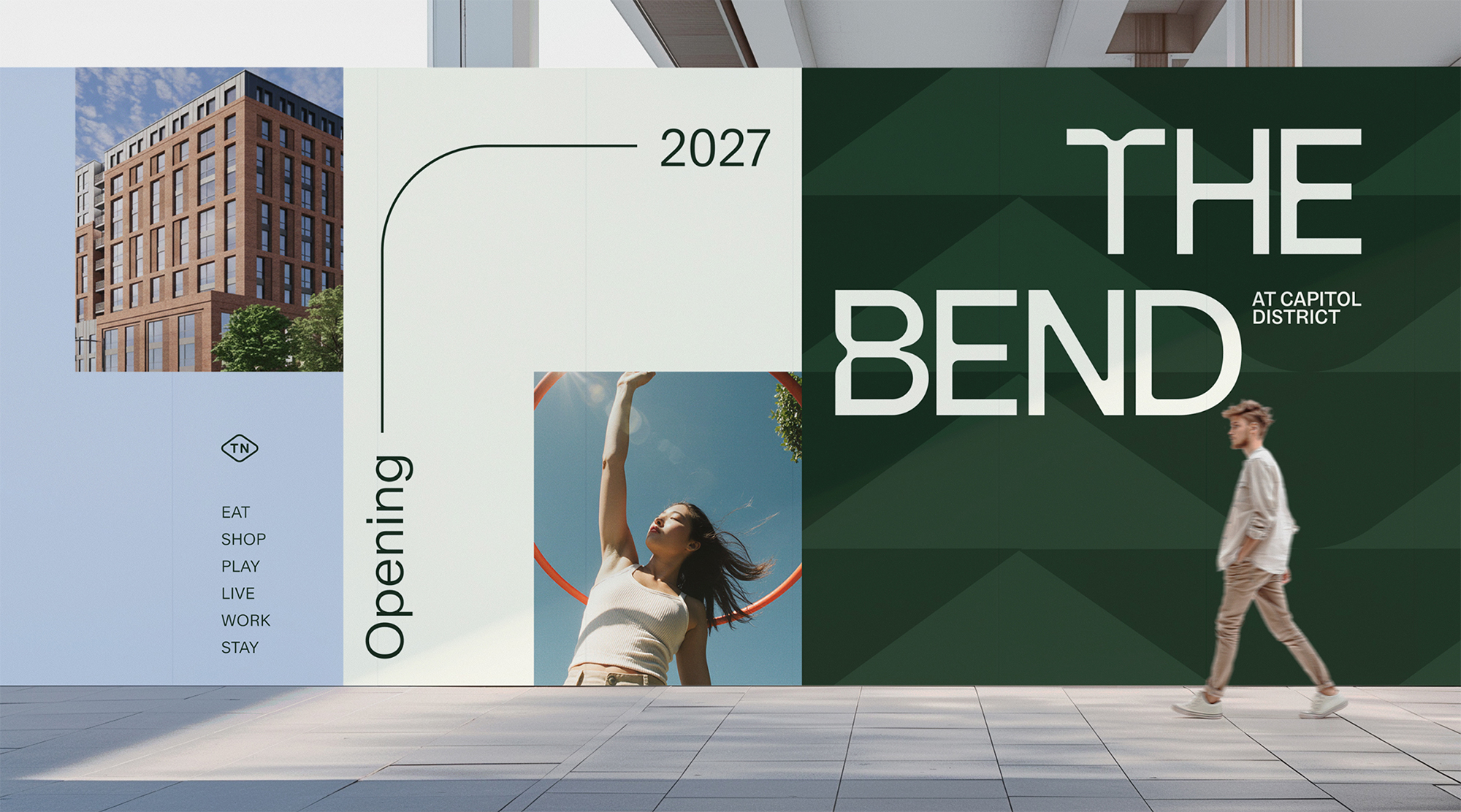
The Bend at
Capitol District
Category
Mixed Use
LocationNashville, TN
ServicesBrand Experience
Rooted in the City. Shaped by the Current. Always in Motion.
The Bend at Capitol District is a 550,000-square-foot mixed-use development in Nashville’s North Capitol neighborhood, located at 450 James Robertson Parkway near the Tennessee State Capitol, Metro Courthouse, downtown entertainment district, Germantown, and the Cumberland River. Developed by Ridgeline Development Partners and Deep Cove Partners, with Skanska USA leading construction, the project extends the successful TownePlace Suites at North Capitol into a walkable urban destination with hospitality, residential, retail, and community gathering space organized around an open-air paseo. For The Gettys Group, the branding assignment was not simply to name a new development. It was to create a cohesive identity for an emerging downtown district, one that could connect a layered mix of experiences while still feeling singular, memorable, and rooted in Nashville.
The Bend is a brand built from movement.
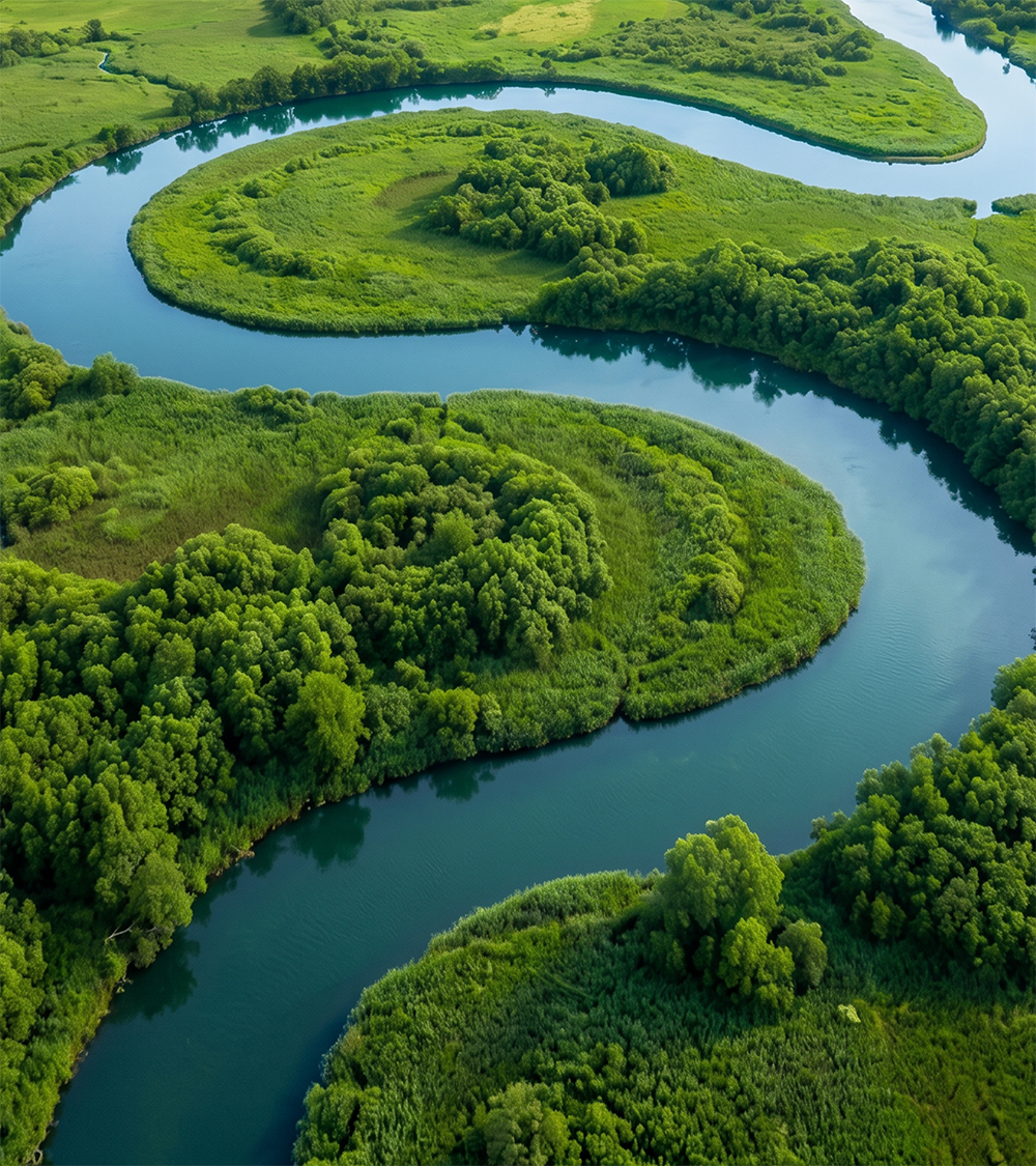
Its name begins with Nashville's geography: the bend of the Cumberland River, the bend of James Robertson Parkway, the curved paseo that will define the experience of the place itself. Created for a 550,000-square-foot urban destination in North Capitol, The Bend needed to do more than identify a development. It needed to give a new part of downtown Nashville a language, a rhythm, and a center of gravity.
The brand strategy frames that as a larger point of view: Celebrate currents of change. Nashville has always been shaped by movement — people, nature, sound, and industry — from the Cumberland River and converging highways to gospel, radio, and Tennessee whiskey. The Bend channels those forces into a brand rooted in the city's past and energized by its future.
The Bend is a brand built from movement.
Its name begins with Nashville's geography: the bend of the Cumberland River, the bend of James Robertson Parkway, the curved paseo that will define the experience of the place itself. Created for a 550,000-square-foot urban destination in North Capitol, The Bend needed to do more than identify a development. It needed to give a new part of downtown Nashville a language, a rhythm, and a center of gravity.
The brand strategy frames that as a larger point of view: Celebrate currents of change. Nashville has always been shaped by movement — people, nature, sound, and industry — from the Cumberland River and converging highways to gospel, radio, and Tennessee whiskey. The Bend channels those forces into a brand rooted in the city's past and energized by its future.
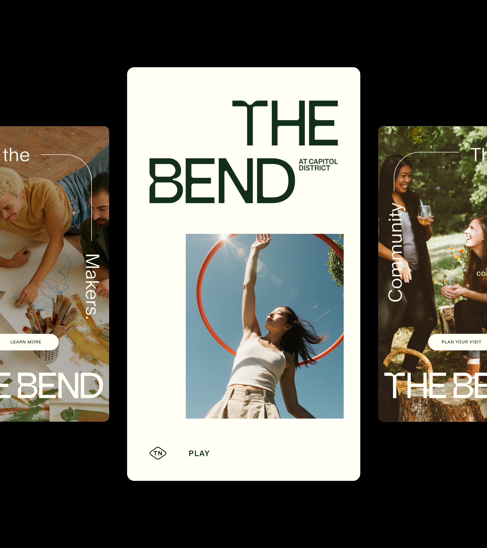
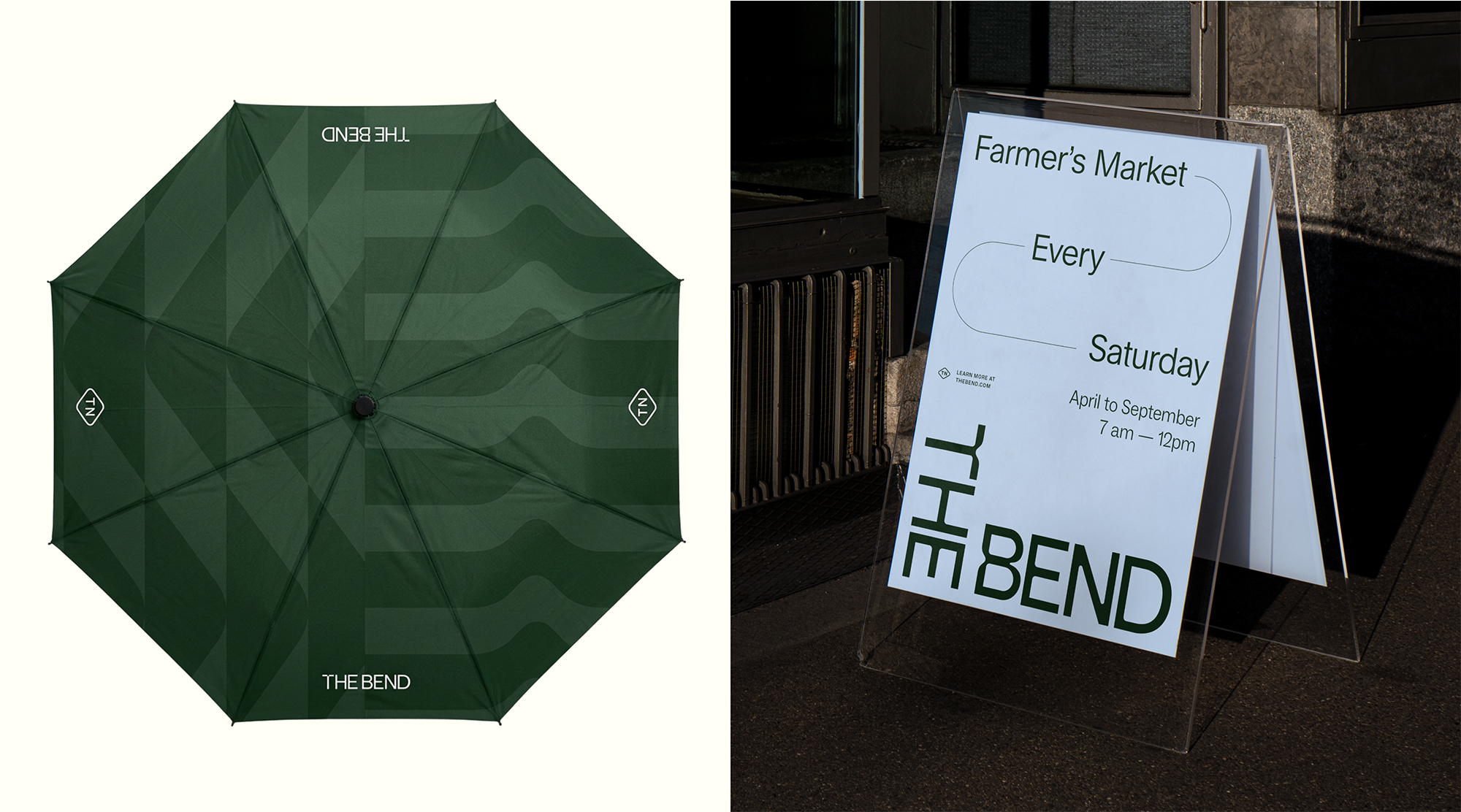
The Bend: Name and Form
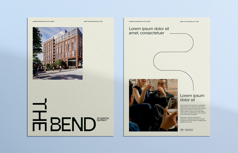
Simple, ownable, and inherently local, The Bend's namesake feels less like a title and more like a place people naturally claim. The full name, The Bend at Capitol District, anchors the brand in its civic location, while the shorthand gives it room to enter everyday Nashville language: meet me at The Bend, concerts at The Bend, markets at The Bend, weekends at The Bend. The name is not decorative. It is directional, geographic, architectural, and social all at once.The Wordmark: A Logo That Bends
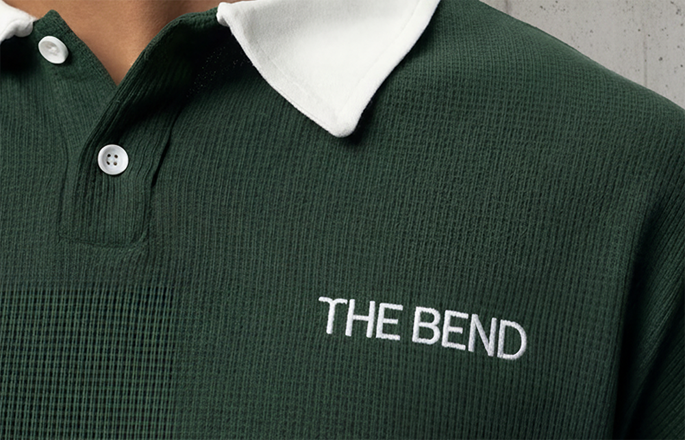
The custom wordmark makes the concept immediately visible. Each letterform contains a bend or curved element, translating the name into a graphic gesture. Organic rounded forms reference the river, while sharper, more structured edges reflect the highways and architecture around the site. The result is a mark that feels both fluid and built: natural, urban, flexible, and strong.

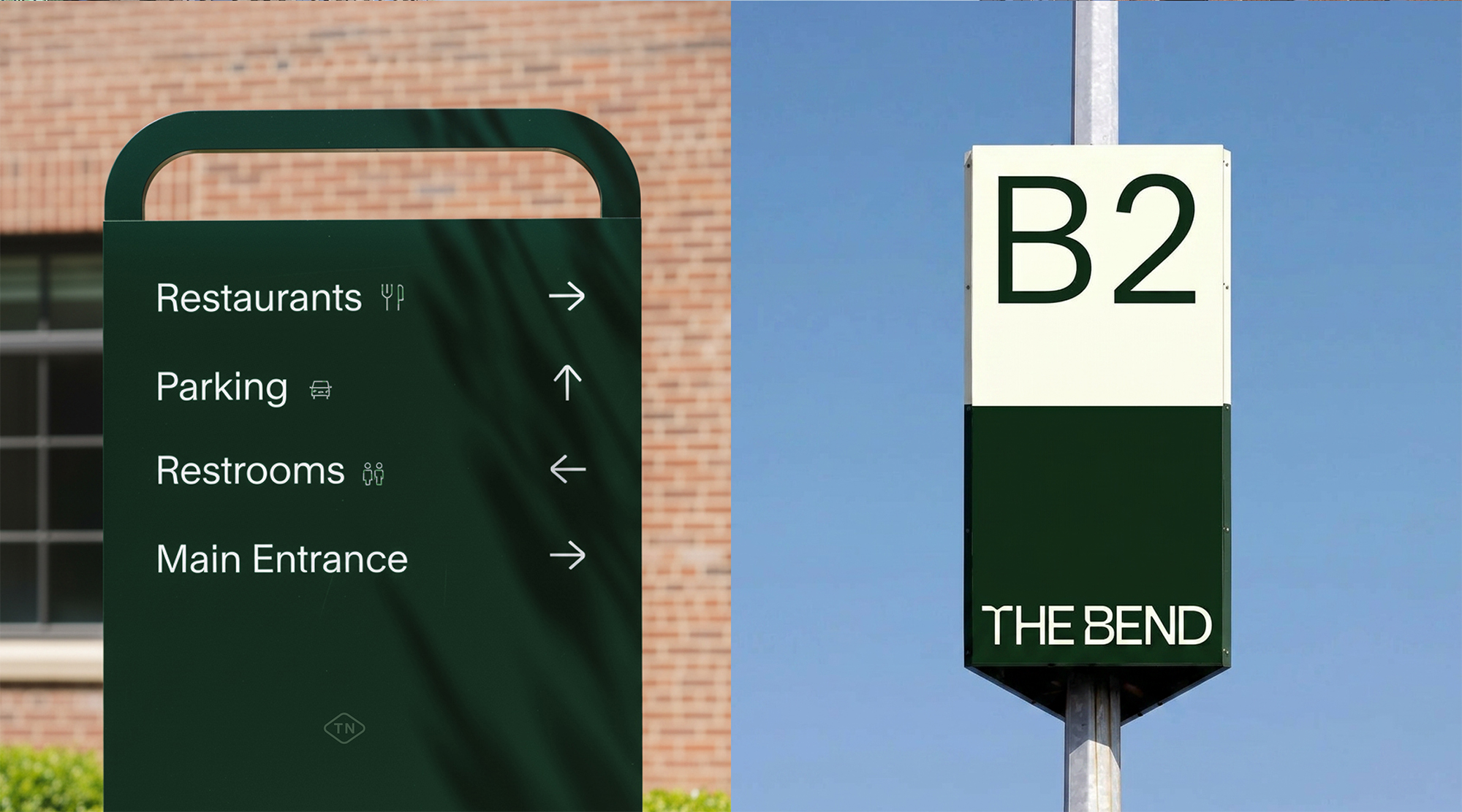
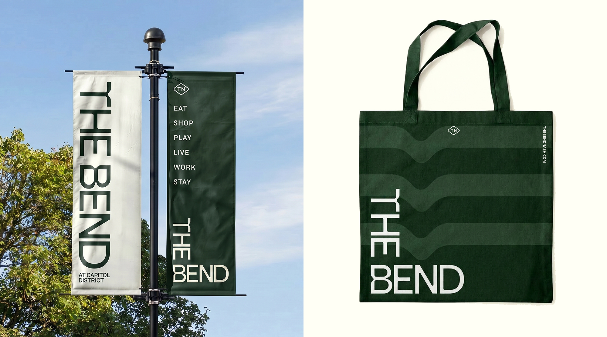
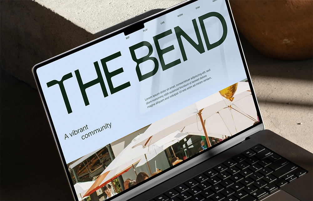
Designed to Flow: A Flexible Identity System
The Bend’s identity was designed to move across a large, layered destination without losing cohesion. Logo variations allow the wordmark to shift orientation, scale, and emphasis while remaining unmistakably recognizable. The secondary logo can stand without the location line when space is limited or when the brand needs a bolder expression, helping the system feel adaptable rather than static.The color palette balances grounded greens and neutrals with vibrant accent tones inspired by the movement and energy of the river's current. Paired with clean, contemporary typography, it creates a cohesive visual language that feels fresh, urban, and flexible across the many experiences that make up The Bend.
Curved lines extend the bend motif beyond the logo, connecting headlines and guiding the eye through layouts. Used selectively, they become a subtle expression of flow and connection. A Tennessee anchor shape adds a localized graphic device for callouts, grounding the identity in place without relying on expected Nashville iconography.
Related Projects

The Farnam, Autograph Collection
As Brilliantly Unexpected as the City that Inspired It
View Project